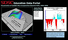
NCSA EasyViz and DataBridge Tutorial
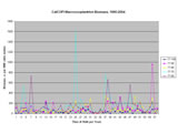
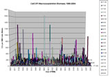
Visualization of Macrozooplankton Biomass
CalCOFI Cruise Data, 1990-2004
Introduction | Background | Goals | Lesson 1 | Lesson 2 | LinksLinks
Data was obtained from these locations in the CalCOFI archives: 1990-1999, 2000-2004
Note: the last column in the data was used ( Small cm3 )
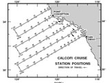
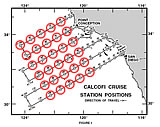
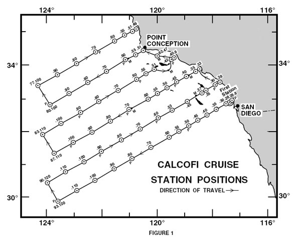
Map of Data Sampling Sites
Click thumbnails to view larger image
|
PHP and Jpgraph (1-Dimensional Exploration)
Click thumbnails to view larger image
 |
| Interactive Map for Time Series Exploration |
Excel Charting (1D and 3D Exploration)
Click thumbnails to view larger image
 |
 |
Macromedia Director and Shockwave 3D (pseudo-3D Exploration)
(Note: this visualization is to allow users to make correlations between the CAlCOFI dataset and El Nino Southern Oscillation Indices)
Geo-referenced Interactive 3D Vizualization (Get Shockwave )
 |
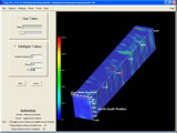
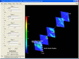
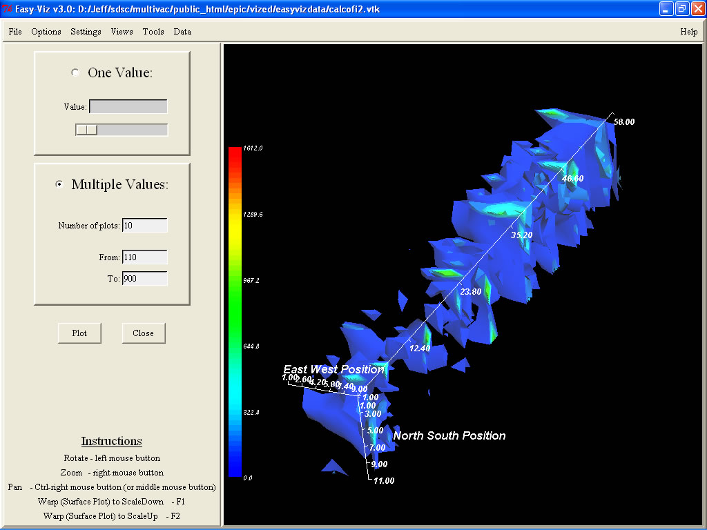
NCSA EasyViz Examples
(Note: this is an exploratory 3D visualization tool that may be appropriate only for advanced high school and undergraduate students)
Click thumbnails to view larger image
 |
 |
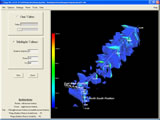 |
CalCOFI Cruise Stations Map
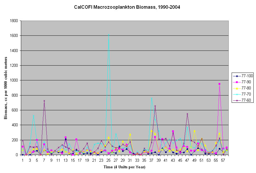
Example Time Series from Sampling Sites 77-100, 77-90, 77-80, 77-70, 77-60
(Data is in units of cm3 per 1000 m3 Strained)
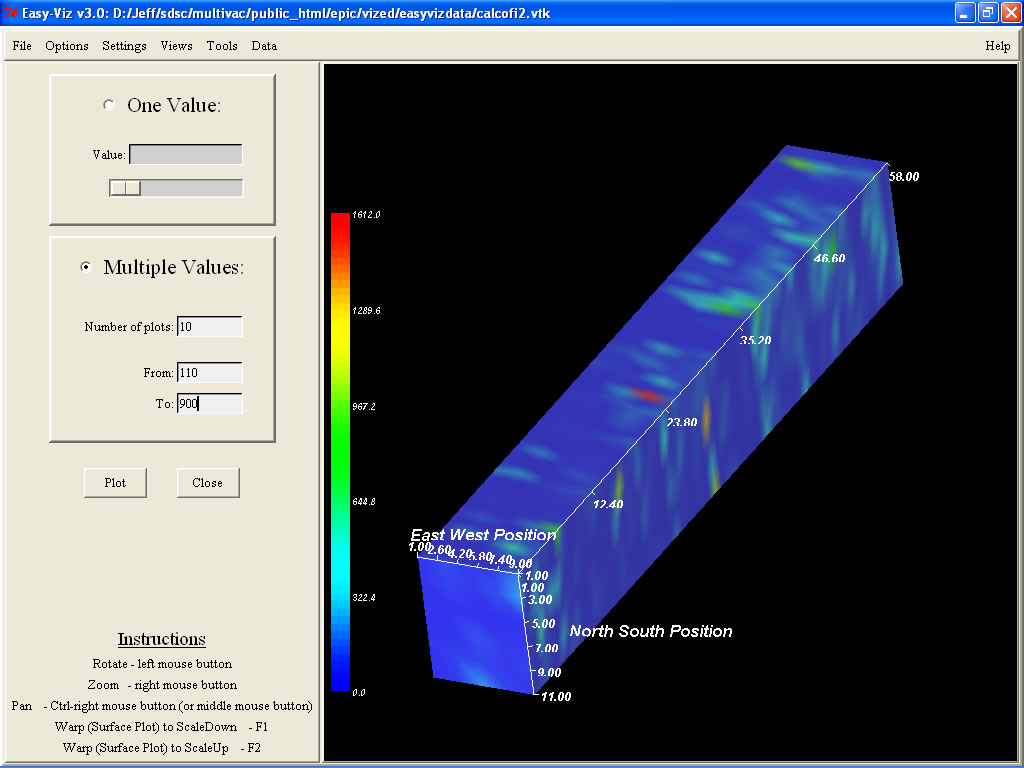
EasyViz Surface Visualization
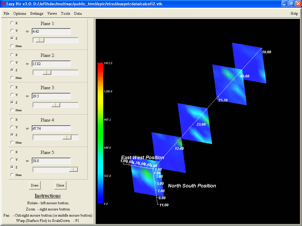
EasyViz Cross Sections
Easy Viz 3D Contours (aka. Spatiotemporal Isosurfaces)
EPIC Education Data Portal, SDSC Education Group, 2005